Plotting the Risk
We can now plot our application risk in a similar matrix:
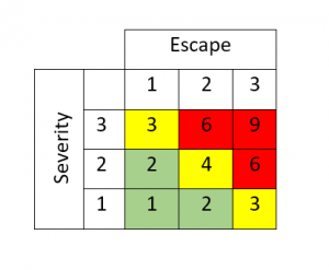
Overall Risk
We use the color coding again to define the overall risk associated with the application.
This basically says:
- If we’re in the green, we have a low-risk application
- If we’re in the yellow, we have a moderate risk application
- If we’re in the red, we have a high-risk application
Risk Based Approach
Again, this needs to be well thought-out and adapted to your company.
You may want to have more levels but it’s probably advisable to not have less.
Based on this, we might establish a risk-based approach similar to the table shown:
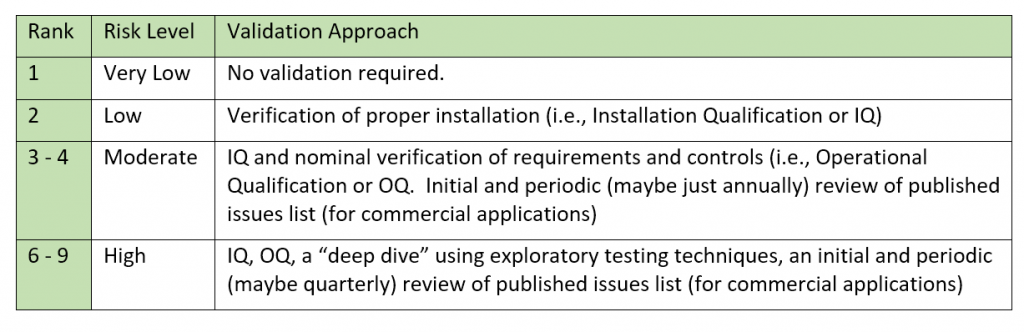
Apologies for springing specific validation approaches on you but it all meshes together and to fully elaborate the risk strategy we had to lay it all out – we’ll provide much more detail on these techniques later on.
Rankings
And, yet again, remember that this is only a simple approach used for illustrations and may not be wholly appropriate for your company. And even if adopted, the rankings and approaches would need to be adapted for your company.
GAMP®5
Note that GAMP®5 considers that custom software has the highest risk (as compared to commercial and configured).
This is absolutely true in terms of the likelihood of latent bugs; however, it has to be framed around risk to the product.
If an application provided data to make a quality decision on the product (device, drugs, etc.) then that has to be the highest risk – whether in commercial or custom software.